As the world continues to evolve, it is inspiring new ways for us to live, connect, and express ourselves. Emerging from these shifts are four key macro-trends:
- A growing focus on wellness and living well for longer.
- A renewed commitment to be mindful in a fast-moving world.
- A spirit of curiosity as we embrace endless new possibilities.
- A search for balance between the offline and online world.
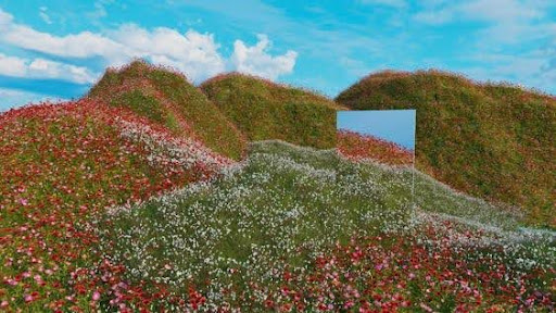
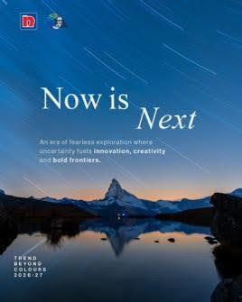
In response to these shifting global mindsets and concerns, Nippon Paint has curated its 2026-27 Trend Beyond Colours, a moodboard of Colour Stories that capture the macro trends of our time and translate them into purposeful and innovative design ideas in collaboration with Colour Hive.
With the theme “Resonate”, the Trend Beyond Colours 2026-27 edition invites professionals to discover which macro-trends resonate with their clients’ needs and encourages them to interpret and weave these insights into their projects.
Turning Global Insights into Design Innovation
These macro-trends are driven by insights into human behaviour and cultural signals, reflecting the evolving dynamics of society. Anchored in data, the colours associated with these macro-trends offer a more objective and meaningful narrative, enhancing the storytelling behind design decisions.
As they remain open-ended and non-prescriptive, these macro-trends provide a solid foundation for designers to explore how these shifts will shape the spaces of tomorrow.

1 A growing focus on wellness and living well for longer.
As people embrace increased longevity and navigate the realities of an ageing population, wellness becomes both a lifestyle and a necessity. This shift is driving a growing focus on sustainability, clean beauty, and natural ingredients, with ancient wellness practices reimagined for a new generation seeking holistic well-being. Wellness, as a whole, is taking on a deeper meaning globally, expanding from the pursuit of living well to the aspiration of living well for longer.
In response to these shifts, there’s a distinct demand for materials and colours that mirror this evolving landscape — inspiring a palette of clean and soft pastels that echo themes of sustainability, balance, and longevity. Reeded, fluted glass paired with Rose Thoughts and Lychee Float creates balanced tranquillity, while pale green marble married with Restful Spot and By The Pond invites thoughtful reflection amidst nature.
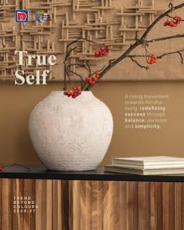
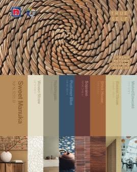
2. A renewed commitment to be mindful in a fast-moving world
The world is in a constant state of motion, seeming only to move and work ever faster. In light of this, individuals are embracing mindful choices and taking ownership of their lives, finding a deeper sense of identity amidst the chaos. People are increasingly rejecting the transient and material, searching instead for a more meaningful sense of security and identity in things that provide a sense of grounding.
This shift inspires a palette of rich, organic tones, reflecting authenticity, tradition, and a grounded, tactile connection to what truly matters. Wicker basketry provides a tactile and mindful element when paired with Postman Blue, while walnut finishes centre more airy, light colours like Muted Emerald and Basket Straw.
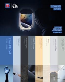
3. A spirit of curiosity as we embrace endless new possibilities.
In a time of uncertainty, there’s a hunger for breakthroughs. From entrepreneurial energy to the AI boom, people are chasing bold new frontiers and charting endless new possibilities. These currents converge into a sleek, bold, and polished aesthetic that is dynamic yet full of wonder, looking past the present to what comes next, with precision and purpose.
This drive is expressed through sleek metallics and bold tones, symbolising ambition, progress, and futuristic possibility. Here, Palest Glow creates a juxtaposition of light and shadow when paired with lava ceramic glaze, capturing the glow on the horizon that many seek to reach. Blue Planet and Monsoon Light, when married with futuristic perforated metal panelling, embody an otherworldly coolness that pulls our gaze to the stars.
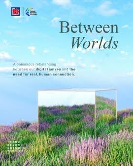
4. A search for balance between the offline and online world.
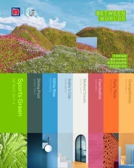
As the line between the offline and online world blurs, people are increasingly navigating a landscape where digital connection and real-life presence coexist yet often leave them feeling alone together. In response, behaviour is tilting intentionally social: time once spent scrolling is moving into shared moments and experience-first gatherings, prioritising shared participation and proving that the most memorable connections are increasingly made in person.
This duality sparks a palette of vibrant, youthful colours, embodying escapism and immersive experiences that bridge the gap between the digital and physical worlds with optimism and dynamic definition. Diving Pool and Glitzy Blue balance the ever-shifting hues of iridescent coating, while brushed stainless steel adds an immersive ambiguity to Fascination and Party Time, effectively blurring the lines between digital and physical.
Creating Spaces that Resonate
“Colour will always play a powerful role in shaping and capturing the way we feel, think, and live in the built environment. With Trend Beyond Colours, we want to move beyond simply dictating which colours we think architects and designers should use. We believe that our Colour Stories have truly brought to light valuable insights that professionals can translate into useful foresights; something that will inspire and inform their creative process. As such, we are excited to partner with industry professionals to bring their creative visions to life and to shape spaces that truly resonate,” enthused Jo-Lynn Yap, Senior Manager, Group Colour Leadership at NIPSEA Group.
The intersection of human behaviour, cultural signals, and data-driven colour choices provides a unique opportunity to create spaces that resonate deeply with the people who inhabit them. For architects and designers looking to push the boundaries of their work, these insights are just the beginning.
For more information about how the Trend Beyond Colours 2026-27 edition can inspire your next design, visit the website here or get in touch with your local Nippon Paint representative.
About NIPSEA Group (Subsidiary of Nippon Paint Holdings Co.)
NIPSEA Group is a global leader, providing innovative solutions in the paint and coatings industry. Headquartered in Singapore, with 147 NIPSEA companies spread throughout 28 geographical locations, the group is Asia Pacific’s No. 1 paint and coatings manufacturer in both production and sales revenue. After more than 60 years of growth, NIPSEA Group has over 30,000 employees with 118 manufacturing facilities and operations, efficiently serving all aspects of the business, from production to customer satisfaction.
With a focus on maximising value to our customers, we push boundaries to deliver high quality solutions that work better for all our partners, tradesmen, and homeowners. The NIPSEA Group’s arsenal of solutions for the industry covers Architectural, Industrial, Automotive and Marine Coatings, as well as a range of products beyond the world of paint and coatings. We have an unyielding drive to focus on customers, providing innovation that works best for all our stakeholders.
More information about NIPSEA Group https://nipsea.group
For media inquiries, please contact:
Vox Eureka, on behalf of NIPSEA Group.
General email: nipsea@voxeureka.com
Madelyn Gan | madelyngan@voxeureka.com
Amanda Low | amanda@voxeureka.com